HoleyCow Steakhouse Menu Website

A Case Study

By Tony Coombes

Overview

The Product

The client wants a menu site for his customers to view their menu from anywhere. Target demographic is adults of all ages: 18 –65+

Project Duration

10/2022 –11/2022

The Problem

Most menu sites are simple & basic and do not offer the user customizable options that consider their diet plan.

The Goal

Create an website that gives the user control over his/her search results that find menu items that match their eating plan/restrictions. We also want it to be user-friendly for senior citizens.

My role

Project manager, Lead UX Designer, Lead Researcher

Responsibilities

Product research, user research, concept, wireframing, prototyping & design.

Understanding the User

User Research: Summary

I conducted moderated research sessions with five participants ranging from 5-10 minutes each. Three participants were between 20 years old and 50 years old. Two participants were over 65 years of age and required reading glasses..

User Research: Pain Points

Membership

Participants felt membership was necessary to use the site.

Facts reset window

Viewing nutrition facts removed the previous menu window.

Persona: Zach

“The older I get, the more health-conscious I become.”

Age:
Education:
Hometown:
Family:
Occupation:

38
BS in Kinesiology
Dallas, TX  USA
Single
Assistant Physical Therapist

Problem Statement

Zach is a health-conscious person who needs access to nutritional data when he dines because he is on a very strict eating plan.

Goals

  • Find restaurants that can suit his dietary restrictions
  • Be able to search menus before deciding on a restaurant with friends
  • Frustrations

  • Hates not knowing if a restaurant can accommodate his eating plan before arriving
  • User Journey Map

    Zach is a fairly intelligent individual and his User Journey was a rather smooth one. It did, however, alert me to a few opportunities for improvement for which I swiftly acted upon.

    Starting the design

    Paper Wireframes

    After quickly hand-drawing iterations of the landing page, I was able to isolate my favorite elements marking them with a ‘star’ to use in my digital mockups.

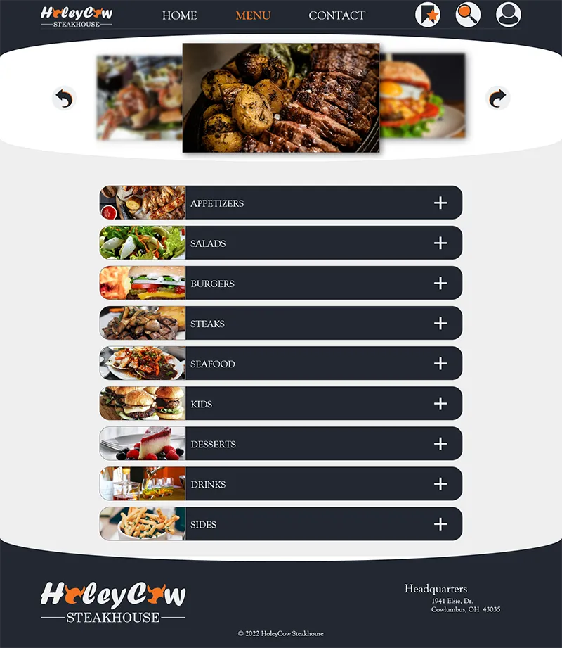
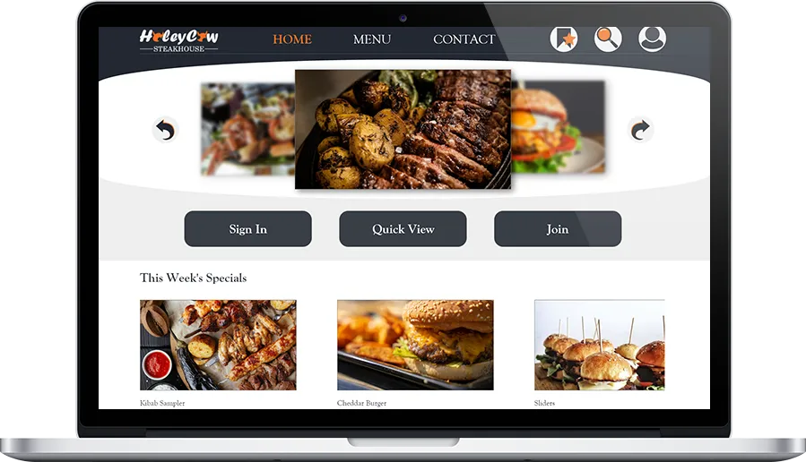
    A Featured Item section to
    showcase the restaurant’s best
    meal lineup.

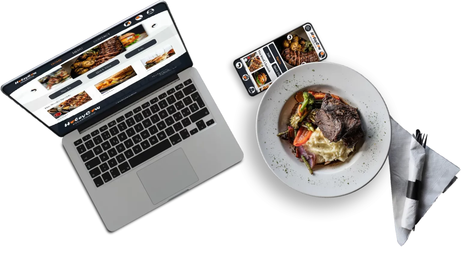
    Sign in / Join buttons are a top
    priority and featured this way
    to promote membership.

    Specials can be featured in
    order to push certain menu
    items at a discount.
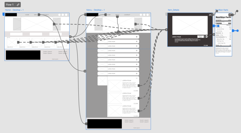
    Digital Wireframes

    I wanted the user to have easy access and a clear flow the second they visited the site.

    I was careful to base my design decisions on user input from the research phase of the design process.

    The original design did not include a “quick view” button of the menu which misled some participants into believing membership was necessary to proceed.

    Using the research feedbackI added a button for “quick view” to let the user know there is an alternative to membership.

    Before
    After

    Low-Fidelity Prototype

    The initial low-fidelity prototype allowed the user to navigate and explore the site, as well as view nutritional info on menu items.

    View the HoleyCowSteakhouse Low-fidelity prototype by clicking the button, below.

    Low-Fi Prototype
    Lorem Ipsum is simply dumy text of the printing typesetting industry lorem ipsum.

    Usability Study: Findings

    I conducted two usability studies during the development for this site. The first was conducted in wireframe mode and revealed issues with icon recognition. The second study went much more smoothly but with no issues found.

    Round 1 Findings

    Round 2 Findings

    Refining the design

    Mockups


    The wireframes provided a loose but clear path for the user flow during the usability studies. However, participants felt membership was a necessity since there wasn’t a quick option to view the menu near the other buttons.

    Before
    After

    Mockups

    High-Fidelity Prototype

    The high-fidelity prototype had much smoother transitions for the user flow. 

    View the HoleyCowSteakhouse High-fidelity prototype by clicking the button, below.

    High-Fi Prototype
    Lorem Ipsum is simply dumy text of the printing typesetting industry lorem ipsum.

    Accessibility Considerations

    I used high-contrast colors for ADA compliance.

    Large Icons and font will be helpful for interactivity throughout the site –but the site should be responsive to the users desktop view settings.

    Going forward

    Takeaways

    IMPACT: The site allows everyone freedom to explore HoleyCow’s dining options no matter where they are. If they’re calling in an order or simply using it in the restaurant, it will provide more info than any printed menu anywhere! It will be a good alternative to those who do not use the app.

    WHAT I LEARNED: I had already created a design for the HoleyCow Steakhouse’s app. Designing this site shortly afterwards was an eye-opening experience to the differences between web  design and phone applications.

    I will certainly add some forethought into future designs that might incorporate both!

    Next steps

    Conduct another round of usability studies to verify pain points have been properly addressed.

    Move product into development.

    Conduct user research via survey’s and analyze data after launch.

    Reach Out!

    My contact information is listed below in the footer of this page. Feel free to contact me in whichever method you prefer. I’d LOVE to hear from you!!

    Thank you for taking the time to review this case study!

    Thank you for visiting my portfolio! I am eager to hear your thoughts & ideas, as well as your criticism and advice! Please take the time to reach out and hit me with your thoughts.

    •