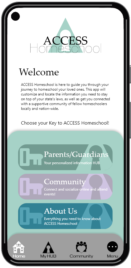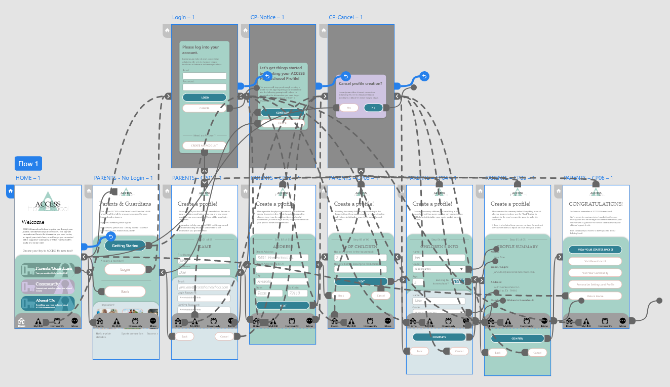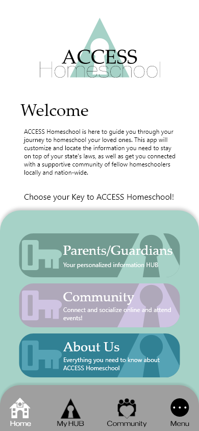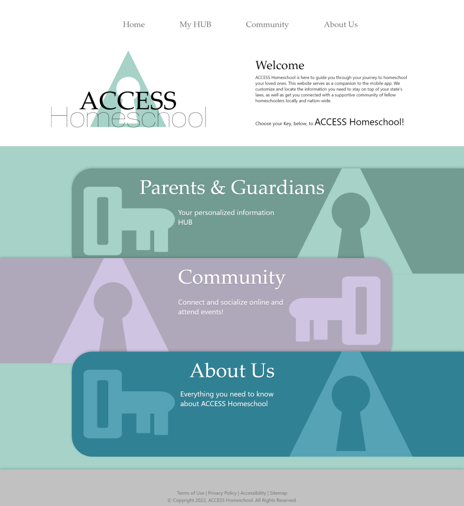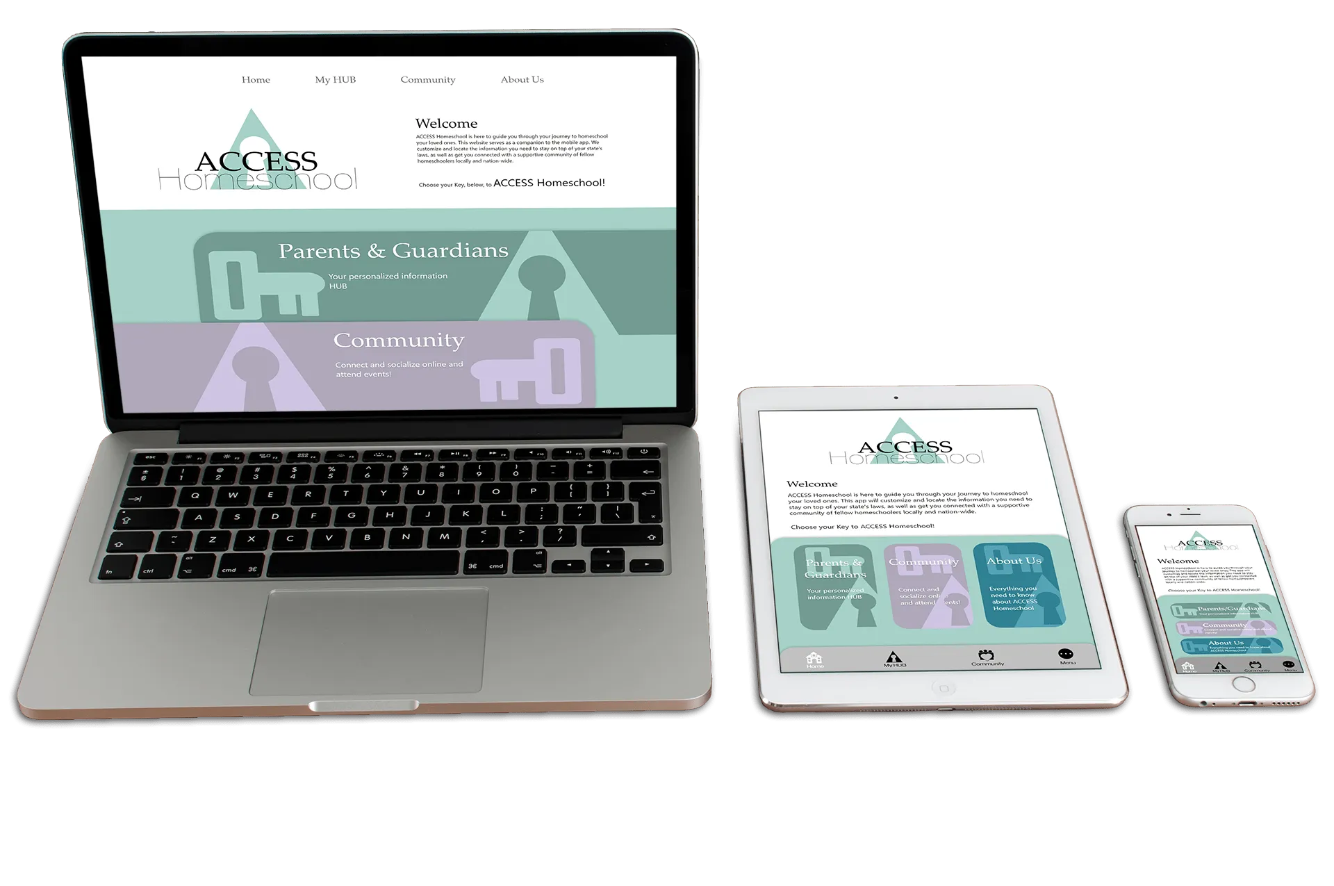
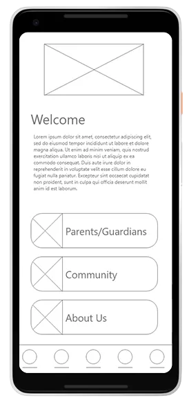
A quick welcome message to let the user know the primary point of and reason for this app.
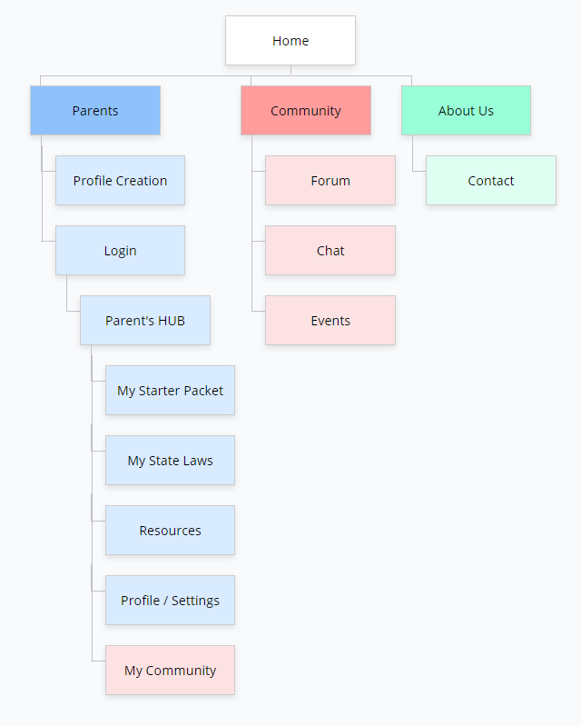
The 3 “Keys” to ACCESS Homeschool
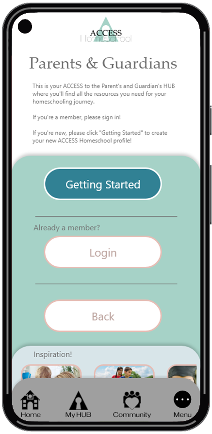
A brief description of the benefits of membership
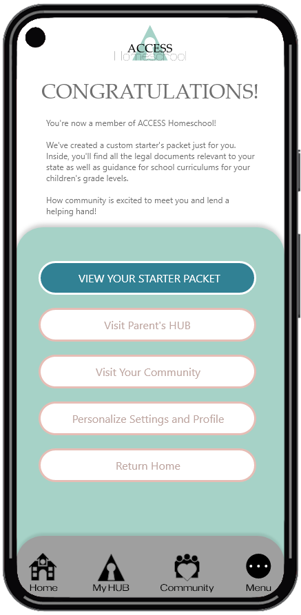
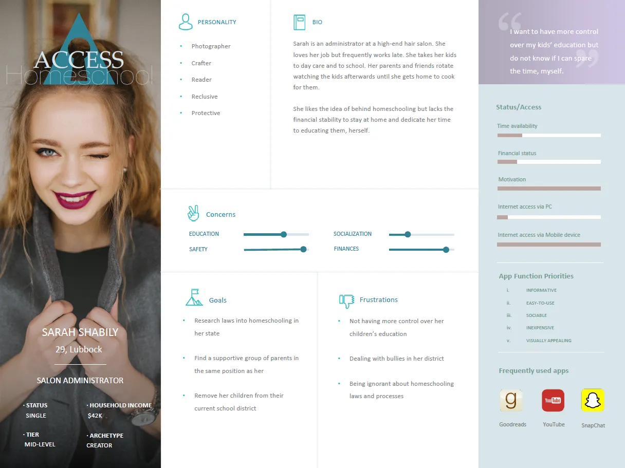
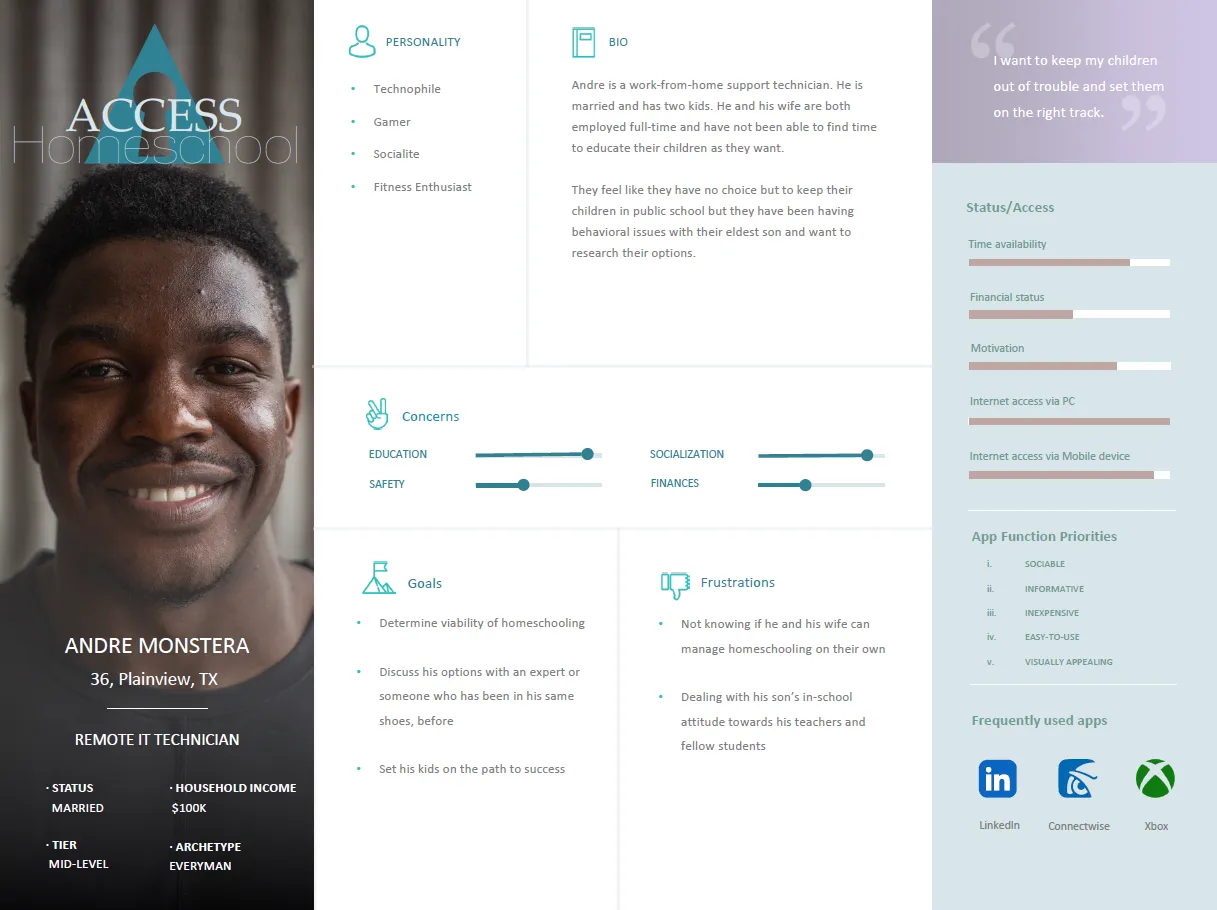
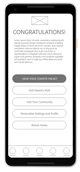
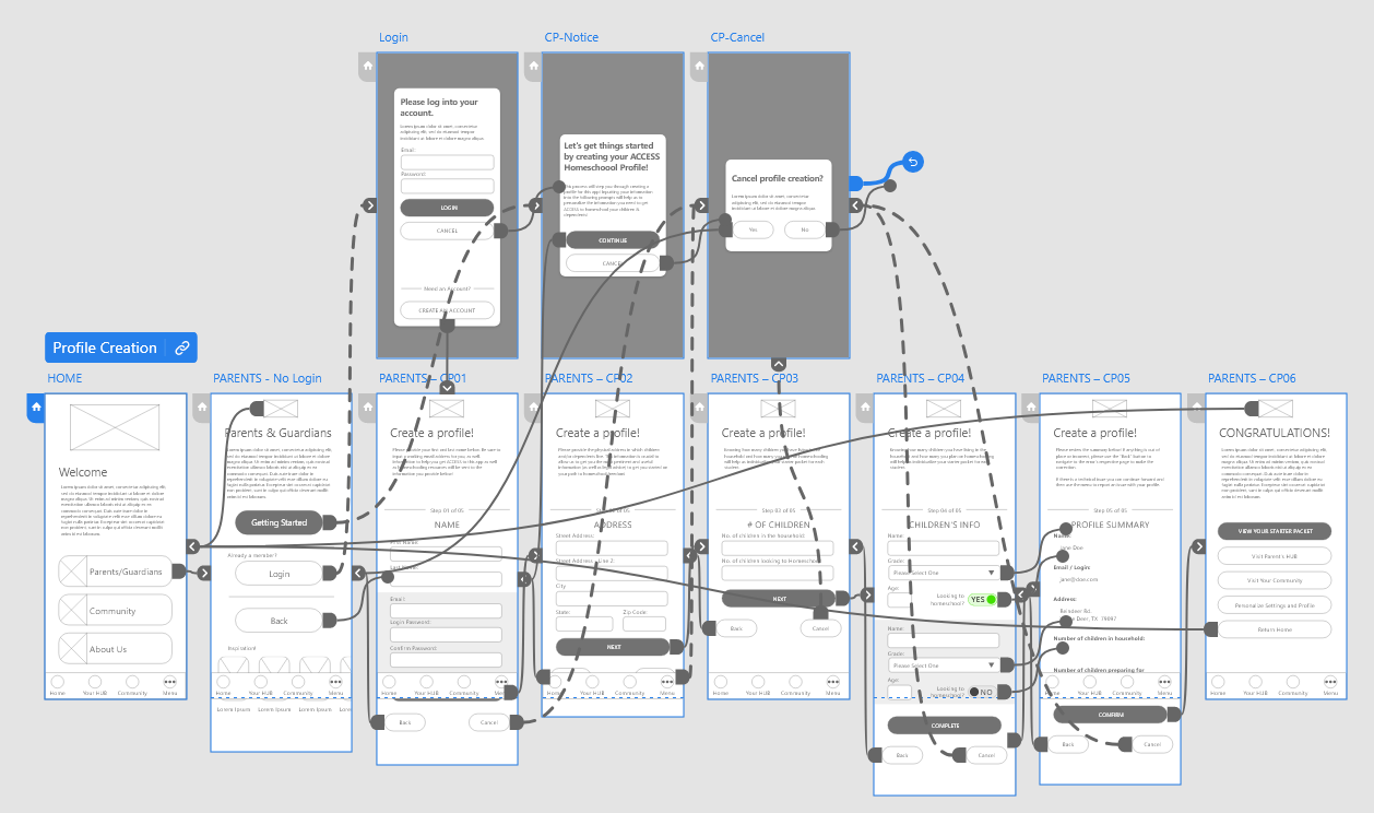
User’s customized info based on the data they input during the profile creation page
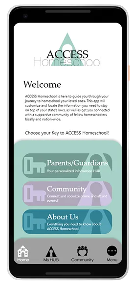
After
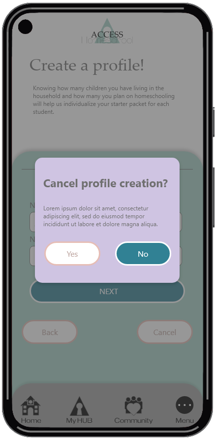
Before
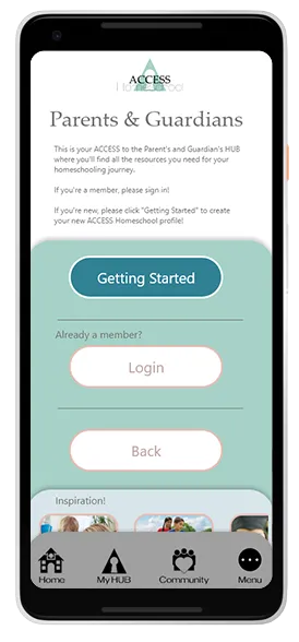
After
Before